Digital Darkroom: Cropping 101
Long post warning: But if you are into digital photography it is probably worth a read. Also there is a picture of seriously cute niece included.
Semi-large pictures warning: Some of the embedded pictures may take a few extra seconds to load as they are up to 100KB in size—which is not big, but big enough to take a bit longer to load.
Here is the third instalment in my Digital Darkroom series. The first was The Basics and the second was Saving Images 101 [Use Ctrl+Click to open in a new Tab, or Shift+Click if you are using Opera].
This instalment is about cropping. There is a view amongst pro-am (professional amateur) and professional photographers that every photograph taken needs some degree of cropping to bring out the best visual experience.
As quickly and as briefly as I can in the three following examples I am going to try and convince you that, in most cases, this is true—you need to crop.
First Example
In this example I use Adobe PhotoShop Elements (PSE) to do the crop.
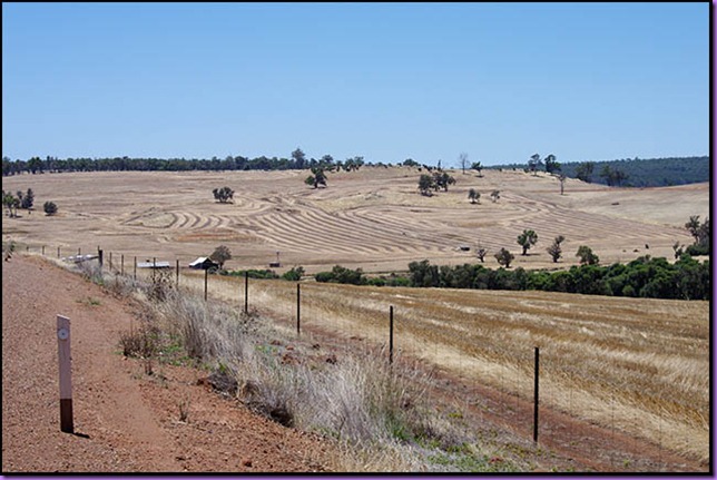
Here is the picture as taken.
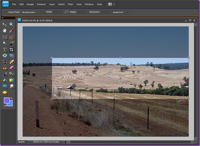
Here is the picture in PSE ready to be cropped so you can see where I am cropping it.
My thinking here is that I basically want the farrowed fallow paddock as the subject. So I am cropping down to that but I need to leave in a useful amount of sky. Also I really don’t want the edge of the road on the left hand side to be in the finished picture, or the road marker post. So I have cropped in such a way that these are not in the final crop.
Following is the result.
The cropped picture looks much different to the picture as taken in-the-field (so to speak).
Note that I have not done any sharpening (unsharpening) or adjustments of levels (which we will be covered in the next instalment), and I have compressed both pictures by the same amount before posting them so that JPG compression aberrations and artifacting is the same for both (not that you can see any of either, hopefully).
Second Example
In this example I have used the free photo editing software from Google called Picasa. The version of Picasa used was v3.6. You can download and install this from here [Ctrl+Click to open in a new Tab].
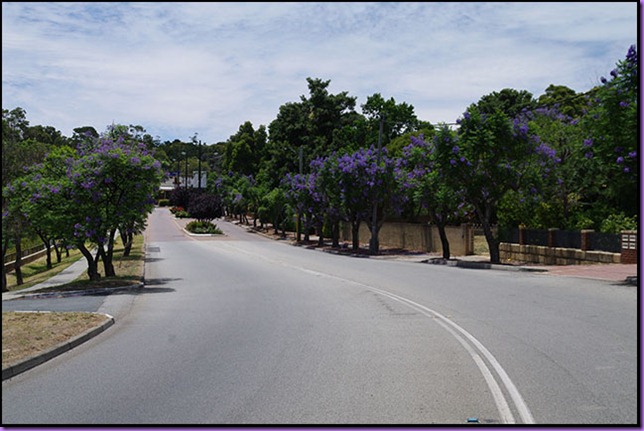
As before, here is the picture as it was taken.
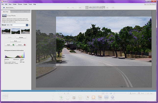
Here is the picture in Picasa being set up for cropping.
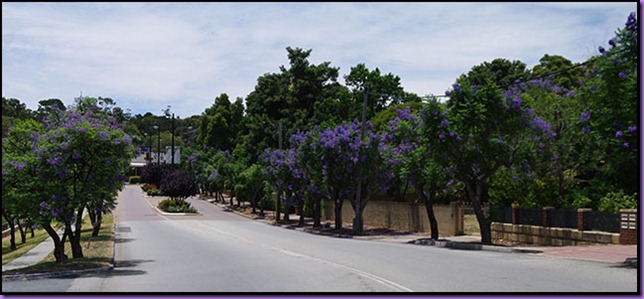
My cropping thinking here is to have the road coming around in the foreground and then sort of going off to the left of the picture, and to fill as much of the picture area with the lilac coloured flowering Jacaranda trees as possible.
This picture was taken at Christmas when the Jacaranda’s in and around Kalamunda Village are in full flower.
Sadly you can’t really get the full impact of the lilac flowers on the Jacaranda’s like I had hoped, but I still think this crop makes a more visually appealing picture than the one taken in the camera. It needs some levels adjusting to bring out the flowers and remove some of the darkness of the trees, but at this stage I am not going into adjusting levels.
Third Example
My third and final example. This time I am using an all time favourite of mine, Corel PhotoPaint. This is the X3 version of PhotoPaint because I never upgraded to X4, and now X5 is due out very soon so I may as well wait for that.
And this time you are in for a bit of a treat because—with her permission—I am going to use a shot of seriously cute niece (SCN) in this example.
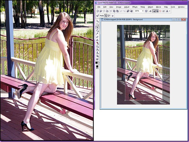
Following on the left is the picture of SCN as taken in the camera, and on the right is the cropping being prepared using Corel PhotoPain X3.
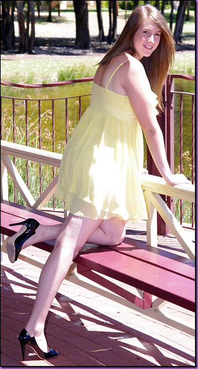
So on the right I have cropped right up to but not ‘onto’ SCN’s hand, and I have elected to leave in the brown twisted upright bar in the guard fence in front of her.
Then I have left a similar gap above her head, and this fits in nicely with cropping out the blue pole to her left.
I can hear the photographers in the audience telling me the picture is ‘blown’, meaning that the highlights are over-white and the levels should be adjusted to try and bring them back. And this is the case for sure. But, at this point, I am not adjusting levels, just showing you cropping.
Assuming I continue to post (because my unique visitor count is very low and actually seems to be trending down, sob) I am going to cover levels in my next post in this series. In that post, assuming I end up using this same picture, I will show you how to recover blown highlights—as long as they are not too blown.
Well, that is about it. If you are the least bit interested then Watch out for “Digital Darkroom: Setting the Levels 101”.



 ’)
’)