Large Service Company; Very Poor Document
In my work I have to consume a lot of documentation. I estimate that on average I need to read and comprehend a new 30+ page technical document about every second day—with many of these documents being produced by very large outsourcing and services companies.
I have to say, the quality of documentation is trending down at an alarming rate. Not only in the layout and formatting, which is bad enough, but also in the construction and readability of the content.

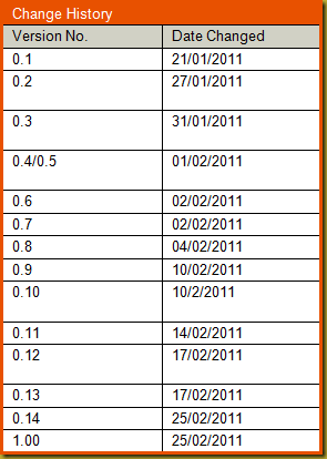
From page 2, at left, is the Change History table. On the upside the author has at least included a Versioning table; though probably only because it was in the template and was a mandatory component of the document.
Can you spot the disturbing error? I had to go and get a fresh coffee when I spotted this it rattled me so much. I kid you not. Seriously.
The versioning goes 0.1, 0.2, 0.3, 0.4/0.5, 0.6, 0.7, 0.8, 0.9 … so far so good … and then … 0.10! Eh! What? How does 0.10 follow 0.9?
Do they not realise that 0.10 is a lower number than 0.9? Hence, technically, the document just went backwards! Backwards all the way to v0.1 again, like it was on the 21/1/2011.
But it gets more depressing. The problem is not picked up by either the author or the four people listed on the same page as reviewers and approvers of the document, and it goes from 0.10 to 0.11, 0.12, 0.13, 0.14, and then jumps all the way to 1.0 as a formally “Released” document.
Man oh man!
Assuming that ISO versioning standards are being followed here then this document would have gone through Peer Review at v0.5 and then Content Complete/Exposure Review at v0.8. After v0.8 the document was presumably made available internally which is what would normally happen with a document at its v0.8 stage. Then after all this it goes to v0.9 and then back to v0.1. How sad is that?
But that is only the start of problems for this document.
Remember, at the point that I got this document it was v1.0 meaning it is “Published” and available to the customer. It is finished with for now. It can go to the printers; so to speak.
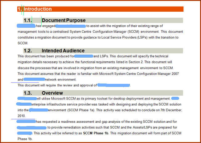
Check out the following snippet of representative content. I have blued out names of companies to avoid getting any phone calls from anyone’s lawyers.
There are so many issues with this example that I hardly know where to start. Firstly the grey shaded secondary headings, which should appear visually subordinate to the primary heading, stand out more than the primary red shaded heading—this is because they are using a larger font. Also they have more leader space (space between the number and the heading text) than the primary headings; as shown by my green markers. This also makes them appear visually ‘more important’ than the primary heading.
Then the body text is a sans serif font. At least line spacing has been increased as it needs to be if you insist on using a sans serif font for printed documentation. But then there is no additional whitespace between paragraphs. The inter-paragraph spacing is exactly the same as the line spacing. Note my blue lines showing you where there should be inter-paragraph whitespace.
Basically the rule is that if you are not going to put additional whitespace between paragraphs to give the reader a visual cue as to where one paragraph finishes and a new one starts, then you should indent the first row of each paragraph by no less than 7 characters. But obviously whoever did this document didn’t do that either. So all through this 70 page document it is a guessing game for the reader to work out when one paragraph ends and a new one starts.
The third thing is that the body text is registered left of the natural heading line. The author could have registered the body text in line with the shading of the secondary headings, or in line with the secondary heading text. But it has actually been registered against the shading of the primary heading—which would be fine if this text followed the primary heading; but it doesn’t. It follows the secondary heading.
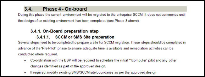
Both in the example above, and the example below, the author has allowed what I know as ‘blue and green’ headings to occur.
They are called ‘blue and green’ headings because of the saying “blue and green should never be seen without something in between”. With blue and green headings there is no content text in between them. This should not occur in a professional document. Content text should follow every heading.
In the first example there is no content text between the primary heading (1.) and the first secondary heading (1.1.). In the second example there is no content text between the tertiary heading (3.4.1) and quaternary heading (3.4.1.1).
Another problem highlighted in the second example is that heading numbering has gone to 4 numbers, and this really should not happen in a technical document. There should only be three levels of numbered headings in a technical document. If a fourth level of heading is required it should not be numbered. A combination of techniques involving bolding, underlining, and italics should be used for minor headings.
My final example taken from this document involves the running heading, which occurs on every page, and the title heading from page one of the actual report.
Can you believe they allowed that one word, “Guide”, to wrap onto a new line by itself? I don’t know what this is called but I bet there is a formatting name for it. Something like ‘crap wrapping’, or maybe something a little more technical like ‘one word wrap’. It’s bad enough that it happens in the title heading (in the shaded red), but it also happens in the running page heading.
This could be fixed by forcing the line to wrap at a better point in the line, as follows.
This works out well because it now says exactly what this document is. It is the “Coexistence Operational Guide” for “Microsoft Systems Centre Configuration Manager”.
Or it could have been fixed by making the line fit better in the one line. This can be done in the shaded title line by using a narrower font (i.e., Arial Narrow) and can be done for the running heading simply by moving the wrap marker 1cm to the right so the word “Guide” is not forced to wrap. Then it looks as follows.
Either solution is much better then how it was left in the v1.0 published document.
Okay. I am finished with that little rant. Sorry. This stuff just bugs me so much. So so much.


