News.Com.Au Looking a Bit Like ‘Metro’
Is it just me or does the new look of the news.com.au site seem very Microsoft Metro-ish?
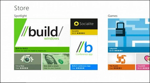
Microsoft’s new Metro user interface, as used for the Zune media device, Phone 7 phones, and in the coming new version of Windows (Windows 8), features a square aligned tile look with crisp plain text.
The news.com.au site recently upgraded their ‘look’ and when I first went to the site after the changes the first thing I thought was that it has a definite Metro interface appearance.
Here is a sample of Metro.
It could just be me … Clicking either image will take you to news.com.au.


