Interesting House Price Graph (vs. Average Income)
Warning: This posting is likely to be pretty boring for my non-Australian readers.
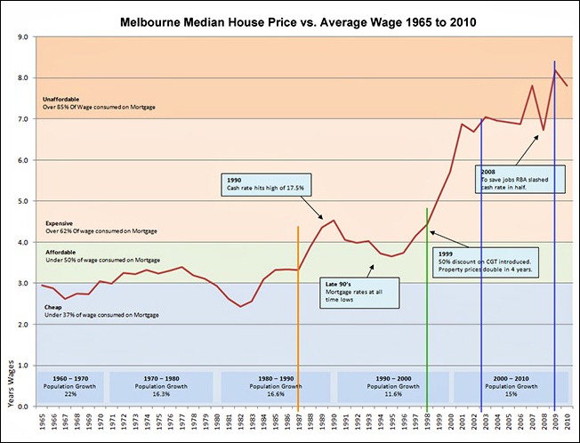
I just came across the following graphic and decided I would do a quick post on it as the situation with house prices is very topical at the moment and I found the following data very interesting. All notes and comments on the graphic except for the orange, green, and blue drop lines were put there by whomsoever made the graph and were not added by me.
[Chart links to where I found it]
The main red plot line represents the median house price for a house in Melbourne between 1965 and 2010. Although this house data is specific to Melbourne I think that the general ‘curve’ is going to be the same all over Australia.

So, back in 1965 servicing a mortgage was in the blue banding at the bottom and took about 37 percent of the average wage. From the chart at right we can see that the average wage in 1965 was $3,193 and the median house price of a house in Melbourne was $9,400.
This 37 percent cost of servicing a mortgage for the average house remained stable for about 22 years up until around 1987 (shown by the orange drop line). After this the cost of servicing a mortgage moved into the 50 percent band and it more or less stayed there for 11 years up until 1998 (shown by the green drop line).
From 1998 to mid-2002 the curve skyrocketed because house prices doubled in just four years but the average wage only increased by 9.5 percent over the same period. The outcome of this is that by 2003 the cost of servicing a mortgage for the average house was now hitting 85 percent of the average wage (blue drop line).
By 2009, where the current curve peaked, it was taking 90 percent of the average gross wage of $66,040 to service the average mortgage with the median price of a house in Melbourne then at $540,000.
But it works out worse than it looks because the wage numbers used are before tax and regular outgoings. So it is likely taking about 130 percent of the average wage after tax and essentials to service the mortgage for the ‘average’ Melbourne house bought in 2009.
What this means is that for the average couple one wage is going totally into the morgage, plus about 30 percent of the second wage.
Economists think that the light green 50 percent band is where the ratio need to get back to for a healthy economy. Based on the 2010 median house price of $524,500 this would require the average wage to increase tomorrow by 56 percent up to $105,000. Alternatively the median house price needs to come down by 35 percent to $340,000.
The question is: “What is going to happen?” The answer is that the experts don’t seem to know. While they all agree the current ratios are toxic (that’s the word they actually use) and cannot continue—apart from a depression triggered reset of the economy—there is no quick fix for the problem that they seem to be able to agree on.
You can see from this why the Reserve Bank of Australia is fighting hard against dropping the wholesale interest rate because they are very concerned that any lowering of the official rate will cause the average house price to bump up—which is the last thing they want to happen. They would actually prefer to raise the wholesale interest rate thereby putting downwards pressure on house prices, but they realise this would be a hugely unpopular move to make. Doing this would adversely impact hundreds of thousands of new home buyers; especially those that are in the salmon banding zone and bought their houses since about 2006.


