Testing on SquareSpace 6 continues . . .
As I think I mentioned a number of posts ago I am looking into converting my site over from SquareSpace v5 to SquareSpace v6. I don’t have to do this because the SquareSpace team have said that they have no intention of stopping v5. But there are two good reasons for me trying to convert from v5 to v6.
The first reason is that I would be able to post pictures up to 900 pixels wide, whereas my current limit with my v5 site is 652. This would allow me to post pictures almost a third wider. For a site that I sort of hope will become more photography focussed it would be of great benefit to be able to post wider ‘landscape’ orientation pictures.
The second reason is that v6 has been designed from the bottom up to cater for mobile devices. When people using any size of tablet or any size smartphone connect to a v6 site the engines behind the site know the type of device connecting. So then they automatically adjust the presentation of the site to better suit the device being used.
Also, instead of images simply being resized by the browser to fit the viewing screen size, they are resampled by the back-end SquareSpace engine before being sent to the viewing device. This means, generally, depending on the starting point image and the device being used to access the site, that the quality of the picture that ends up on the screen is much better.
It has not been easy duplicating the look of my v5 site in v6 but I am relatively close now.
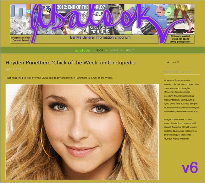
Below are two screen captures. The first screen capture is from the test v6 site. The second screen capture is of the same posting from my existing v5 site. Both captures were done in the same size screen browser at full width. So this means, even though the images are reduced to fit my posting width here, that the relative size difference is perfect (i.e., the representation is to scale).
Ignore the sidebar gibberish in the v6 screen grab. At this stage in my testing I have not done anything with the sidebar.
You can instantly see the obvious difference. While the sidebar is effectively the same width (it is actually a tiny 12 pixels wider), the main posting area is much wider. It is now 900 pixels compared to 650 pixel previously.
There are downsides. There are ALWAYS downsides. Following are the two biggest downsides.
Firstly, due to the way v6 works, none of the desktop content creation tools will work with it. This means Live Writer, which I use for v5, and am using now to create this entry, cannot be used to create content for v6. Basically to key up posts for v6 you have to log into SquareSpace and do it there.
This is a big hurdle for me. I love Live Writer. I have Live Writer configured so it works from Microsoft’s Skydrive. This means I can use Live Writer installed on any computer anywhere and create and edit posts stored in the Skydrive.
Also, I seriously hate entering content into Web-browser based tools. They are slow, all the short-cut keys I know and love do not work, they typically don’t have as-you-key spell checking (in fact the SquareSpace 6 online editor does not have any form of spell checking), and the interfaces are generally clumsy due to the limitations of working via a browser.
Secondly, when I import all my existing content from my v5 site the formatting that I took care to get just how I wanted it (with each an every post) is going to get wrecked. The only way for this to be ‘fixed’ is for me to review all of my past postings and, one by one, fix up any really bad formatting failures caused by the import.
See … it is not easy running and maintaining a quality site.
If anyone who has converted to SquareSpace 6 has any thoughts or ideas to share then please post a comment or e-mail me.


