First Look at Microsoft Office v15 (Office 2013)
Like hundreds of thousands of other people around the world I have downloaded and had a small play with Microsoft’s latest release of their Office Suite. Known internally as Version 15 of Office—but likely to be marketed as Microsoft Office 2013—the latest version of Office has a very plain, flat, basic look compared to Office 2007 (v12) or Office 2010 (v14).
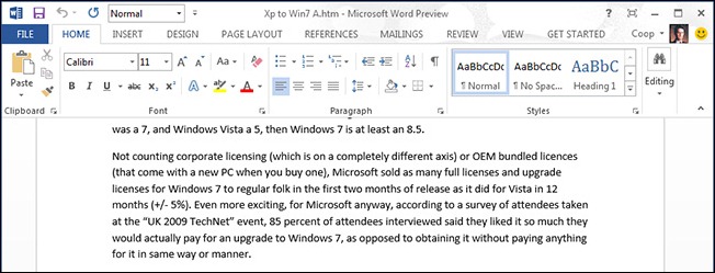
See for yourself. This is what Word 15 looks like. Seriously. I have not accidently reduced this to black and white or something. This is how it looks!
The interface is so plain that it is a bit hard to work out where the Ribbon finishes and the document starts. It is even worse in Excel.
As far as I can work out there is no way to change the colour scheme to try and make things look a little more distinct. Maybe they will add something into the final release to allow this because, as a dedicated and frequent user of Office and Word over tens of years, I find the flat plain white fade-to-grey ‘look’ somewhat off-putting. Off-putting enough for me to seriously consider, for the first time ever, to not upgrade.
Sadly Word 15 still does not support blogging to SquareSpace. I will have to continue to use Microsoft Live Writer although Paul Thurrott tells us that Live Writer is not part of the new Windows Essentials Pack—so does that mean the end of Live Writer, or has it simply moved?
Microsoft are expected to release Office v15 before the end of the year, possibly about a month after Windows 8 comes out in October—which would put the Office 2013 release in November. Based on what I have seen so far I will not be rushing to by any upgrades.


