Thought About Changing the ‘Look’ of My Site
My site is hosted by SquareSpace. SquareSpace provides all kinds of controls and sliders that allow you to customise and change the look of the site. You can add columns, make columns wider or narrower (within certain parameters), add menu items, add widgets, change backgrounds, change colours, pick your own fonts, add template overlays, etc., etc.
Anyone who has used any of the major template-based hosted-blogs available on the InterWeb (e.g., blogger/blogspot, tumblr, WordPress, TypePad) will know what I mean.
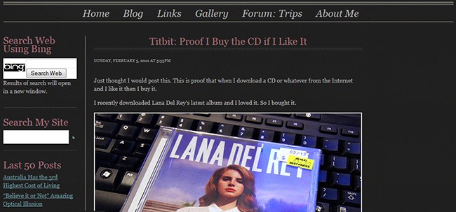
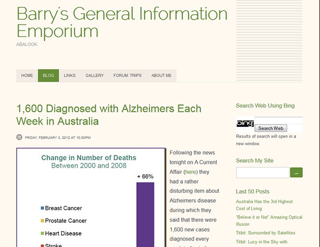
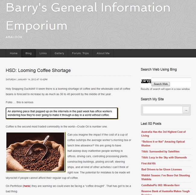
I played around with a few things. I tried four or five of the other templates, and did some colour and background pattern changes, tried putting the narrow column on the left instead of the right, and tried some font variations.
You can see a few of the various ‘looks’ that I played with here.
But, in the end, at this stage I decided that I would not make any changes.
One of the advantages of the current template I am using is that I have a body text area that is 650 pixels wide so I am able to post relatively wide images. Many of the other templates have narrower body text columns which would mean a lot of the images I have already posted over the years would get the right-hand side cropped or would get re-sized smaller.
Also I understand that SquareSpace are supposed to the introducing a major update to their site builder sometime later this year which will make new formatting capabilities available. If this is so then I should probably hold off on any site changes until I can see what the new formatting options that SquareSpace has coming look like and what they will allow me to do.


