Serif Fonts Best for Hardcopy
As any trained hardcopy layout professional knows you must (almost) always use serif fonts for copy that is intended to be consumed as hardcopy (i.e., printed).

The only time you might use a sans serif font in a magazine or newspaper is if you are using very narrow columns (typically 5 words wide or less) or if you want a particular column that is sort of ‘buried’ in amongst other columns to appear different for some reason. Such columns are often referred to as side-bars or fly-outs.
An example of the above follows, taken from the National Geographic magazine. The main article on “Pathogens: Our Friend, the Plague” is in a serif font, but there is a side-bar to the right using a sans-serif font, which—for added effect—has been shaded.
For the average person, reading printed text with a line length of more than 15 words is a problem; whether they realise it or not. With over-width lines the re-read factor is 60 percent lower when serif fonts are used compared to using sans serif. Additionally the first-pass comprehension rate (understanding of what is being read on the first reading pass) can be as much as 500% higher (depending on the reader’s skill) when reading hardcopy set out using serif fonts.
There is a very good reason most legal contracts are set out using long lines in a sans serif font (grin goes here). Doing this makes them considerably harder to read (you are being forced to re-read the lines by the layout) and lowers the comprehensibility.

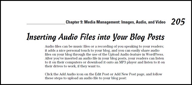
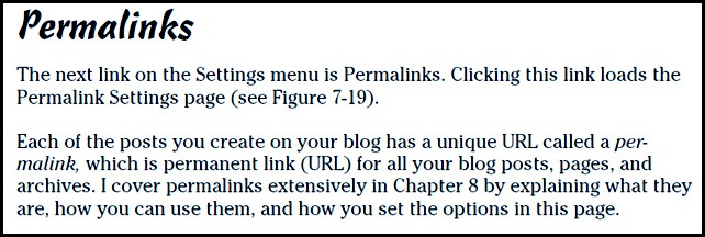
The font they chose for body text was the serif font ITC Cheltenham Book, which interestingly—for those into fonts—is the main font used for the printed version of the New York Times.
Following is part of a page from the For Dummies guide for bloggers (yes, I actually have this guide). In this cutting I have provided the full page width so you can also see the use of white space. Here you can see the ITC Cheltenham Book font with its almost perfect inter-character spacing and its slightly over-sized ‘x’ height (the height of lower case characters above the baseline). Also astute readers might notice that the line length runs at the recommended maximum of 15 words per line for readability. Hence the reason the left and right margins are placed where they are.
The following image shows ITC Cheltenham Book a little closer up. I have trimmed off the margins from the cutting.
Well … I don’t want to bore you about serif fonts. I have tried to make this interesting and informative.
Bottom Line: If you create documentation for hardcopy consumption then use a serif font for your body text, unless it is your intention to make your copy hard to read and harder to comprehend (for example, maybe you write car insurance policies or government policy documents).


