Amazing Transformation: Designed Desktop Wallpaper
NSFW warning: A reduced size desktop wallpaper image occurs later in this post that shows a woman’s top-half best bits exposed.
This is likely to be considered NSFW.
From time to time friends, ex-workmates, and current workmates e-mail me stuff. These are mostly jokes or links to sites with “funny” stuff on them. Most of these rate little more than a very quick open and glance, and then I hit the Del (delete) key.
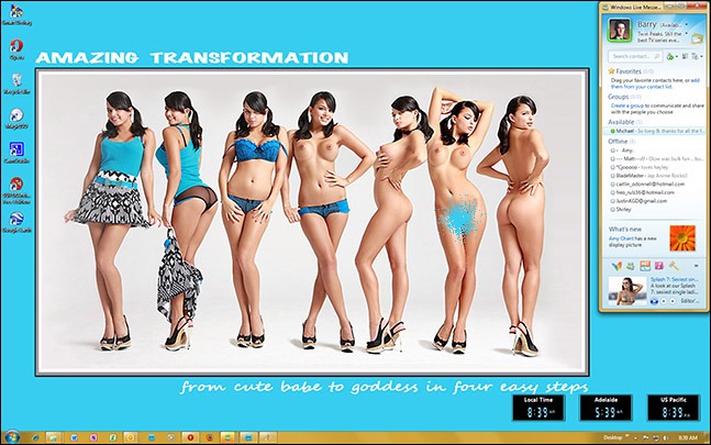
But sometimes something slightly more interesting turns up. Such as the wallpaper shown later. This wallpaper, called “Amazing Transformation”, is not your average wallpaper and I am not just referring to the amazing transformation photo sequence.
It might not be immediately obvious but the wallpaper is the full size of the screen, which is 1680 x 1050 pixels. It is not just the picture section in the centre of the screen. The bright blue surrounding colour is also part of the wallpaper.
So what!?
Well, unlike 99% of desktop wallpapers you tend to find on the Web, this wallpaper has been carefully crafted and set out by its creator so that when it is set as ‘centred’ on a 1680 x 1050 screen there is:
- a gutter running down the left side of the screen wide enough to allow a single row of desktop shortcuts without the shortcuts encroaching on the main wallpaper image;
- sufficient room provided on the right hand side of the screen for an instant messaging panel, which in this case is Microsoft’s Live Messenger, again without it running over the main wallpaper image;
- desktop space provided above and below the main image to allow for ‘gadgets’ or ‘widgets’ to be located on the screen without them having to cover the main image, and in this case I have put three clock widgets across the bottom right hand side of my desktop to illustrate what I mean; and finally
- no part of the main image is being covered by the Windows taskbar at the bottom of the screen as would normally be the case with a full-screen wallpaper image.
I thought this was pretty clever—even though it results in a much smaller main image, but on modern 20” and larger screens with resolutions of 1680 x 1050 and higher this is generally not a big problem.
Mind, as I was using the wallpaper over a few days just to test it out (cough), I did find the blue-cyan background colour a bit ‘full on’—for a desktop wallpaper. I realise that the designer of the wallpaper probably matched it with either the colour in the girl’s top (looks like a close match to that) or a colour sample from her bra, but it does sort of really glare at you a bit when you have had it on your screen for a little while. If I was going to use this wallpaper long term I would be temped to use a photo editor like Corel Paint or Adobe Photoshop to replace the blue-cyan with something a little less blinding; possibly just a darker blue.
Anyway, my aim was to just point out some attributes of a well designed wallpaper, as opposed to those wallpapers that are just a picture enlarged and cropped to fill the screen.
And I also got to put some eye-candy into a post, which is not always that easy to achieve.


