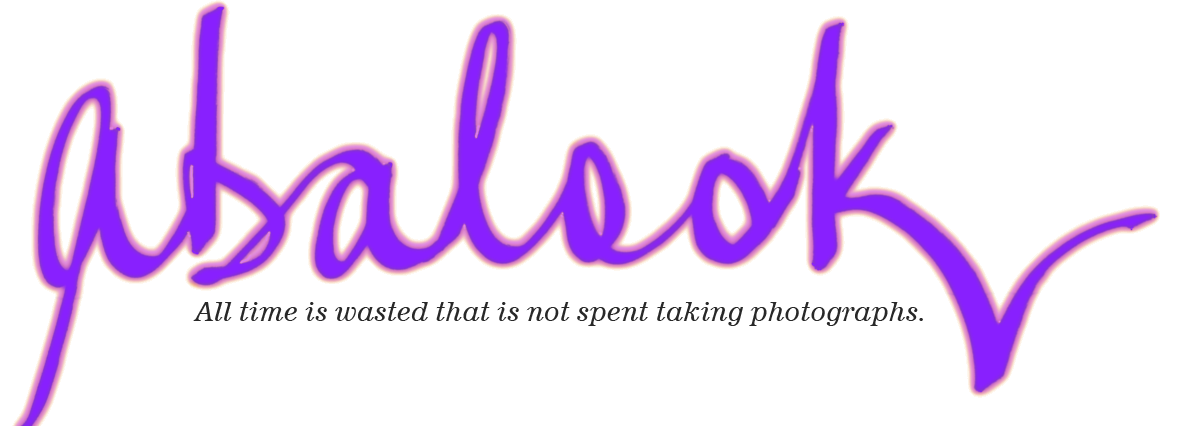
Working on New Site Banner: Forgive My First Attempt
If you have not been to this site before then you will not notice that the site banner has changed. It used to be the banner shown below.

But I thought this banner was a little too 'corporate' looking for the Web. This is probably because my background is in the corporate IT arena so when I cooked up my first Web banner it just naturally came out looking 'corporate'.
But I wanted to soften the look, make it more Web-looking, so I am experimenting with more relaxed and fun banner designs. I am not an expert at doing this kind of thing so it might take me a while to come up with something suitable for my site.
In case it is no longer the current banner—which it might not be in a week's time—my first attempt at a less corporate style banner is this one; and as I write this entry this is the Web site banner.

Just a random play with PhotoShop Elements 8, and it looks like it too—but certainly less corporate you would have to agree.
Feel free to provide feedback on my various attempts as I work through them, and if anyone out there happens to be a dab hand at artwork and wants to submit a suggestion or two then you can send them through to 8percent@westnet.com.au. The pixel width of the banner is 885 if you want to do it to size.
Basically I want to capture the "abalook" site name in the banner, along with the fact that my web site or blog is a "general" information blog containing great little glad-I-know-that-now bits of information and insights (well I think so anyway). I also want the tag "all time is wasted wot is not spent taking photographs" subtly inlcuded somewhere/somehow to impart the view that I am a mad keen photographer. I just love to see the focussed shot lined up in the viewfinder, the shutter speed and aperture how I need them for the results I want, and then hear the sounds of the camera doing its stuff as I push the shutter release button (not that there is an actual shutter is released in a digital camera, but it sounds and feels the same).
Oh, also, I intend to gradually change over to an orange colour scheme, so that probably needs to be considered by anyone thinking of helping out with banner artwork.
Oh, oh (double oh), also, the font used for the "Barry's General Information Emporium" part is a free font called DIAVLO that can be downloaded from this site [Ctrl+Click to open this site in a new Tab]. If you do not know how to install a font into you operating system's font tables then you might need seek assistance from you friendly IT support person (son, Uncle, dad, sister, whomever).

