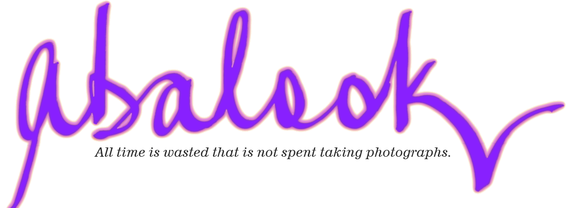
Working on a New Site Banner: 2nd Attempt
Really short post . . .
I got a tiny bit of feedback on the my first attempt at a new site banner. There was a suggestion that I leave out the 70s style pop-art colouring and just use a bright solid blue for the word 'abalook'.
So here it is posted here and in the banner. It is posted here so that when I update the banner next time it is still here as a reference to see what it looked like.


